
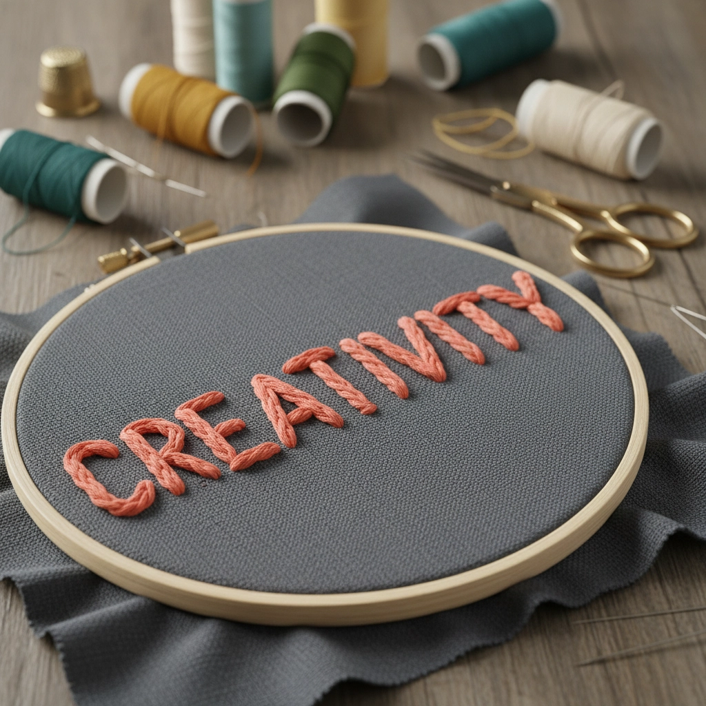
What Embroidery Stitch Is Best for Lettering?
Summary: At Artemis Awards and Apparel, when folks ask “what embroidery stitch is best for lettering,” we usually steer them to satin stitch for clean, professional results. For larger logos or block letters, fill stitch (tatami) wins on coverage and durability, while running stitch keeps small, delicate lettering readable. Bottom line: the best embroidery stitch for lettering depends on letter size, fabric, and font style—so test before you stitch.
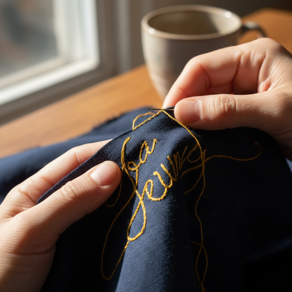
If you’ve ever admired a beautifully stitched name on a jacket or cap, you know how much the right stitch matters. We see it every day in the shop—choose the wrong stitch and letters get bulky, fuzzy, or lost. Choose the right one and boom: crisp, dimensional, and photo-ready. Let’s break it down in plain language.
Satin Stitch: The Gold Standard for Lettering
When you want clean, pro, and a little shiny, satin stitch is our go-to. It lays smooth, closely packed rows of thread that catch the light—perfect for medium to large letters (about 1/4 inch and up). We love it for names on polos and monograms on jackets. Ever seen letters that look “pillowy” and pop? That’s satin doing its thing.
Pros:
- Smooth, glossy appearance
- Great coverage and durability
- Works well on most fabrics
Cons:
- Not ideal for tiny lettering (under ~1/4 inch)
- Can look bulky on very stretchy fabrics
Fill Stitch (Tatami Stitch): For Larger or Bold Fonts
When letters get big or chunky, fill stitch steps in. It uses a patterned, woven texture to cover wide areas without piling on too much thickness. We reach for it on large block fonts, jacket backs, and tote bags—anywhere you need consistency and staying power.
Pros:
- Even coverage on big designs
- Holds up well to wear and washing
- Lets us play with angles and textures
Cons:
- Less shine than satin
- Can feel heavy on thin fabrics
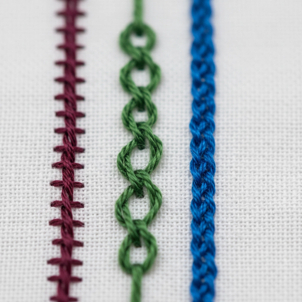
Running Stitch: Simple and Subtle
For minimalist vibes or tiny detail, running stitch is the quiet hero. It traces the outline of letters with a clean, hand-stitched look—great for delicate scripts, outline fonts, and vintage-inspired designs. We use it when “whisper, don’t shout” is the brief.
Pros:
- Perfect for fine detail and small text
- Soft, hand-embroidered feel
- Quick to stitch
Cons:
- Not bold or shiny
- Can blend into busy fabrics
Bonus Tip: Match Stitch to Font Style
- Block or bold fonts: Satin or fill stitch
- Thin or script fonts: Running stitch or light satin
- Logos or large monograms: Fill stitch for consistent texture
Bottom Line
If you want polished, readable lettering that lasts, satin stitch is usually our first pick. But hey, mix it up—use fill for larger logos and running stitch for that handmade vibe. The best embroidery stitch for lettering depends on size, fabric, and style. Our advice? Do a quick test swatch, then stitch with confidence. And if you want us to sanity-check your file, we’re happy to help!